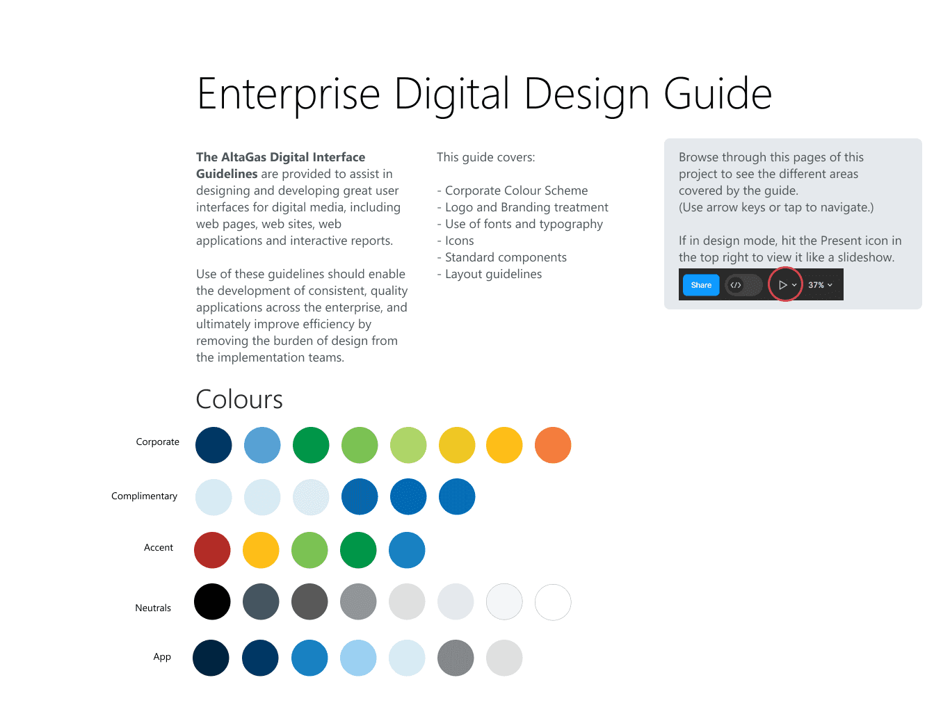
Project Overview
AltaGas Corporate Communications had defined a brand identity which needed revision. It was heavily focused on print and web look & feel. Digital applications and reports had no clear guidelines to follow.
With no voice of design in the Digital department, corporate guidelines were being followed loosely, if at all. By creating a component library, consistent look, feel and behaviors could be specified.
My Role: UX Architect
Projects: User Experience Information Architecture
Client: AltaGas
Tools used: Figma
Business Impact
By spending the effort to create Design Guidelines and to create a digital design library, the business was empowered to:
Produce application prototypes more quickly, with a consistent, clean design
Visualize more ambitious and useful report dashboards to be reviewed by more users in the business and refined before implementation
Integrate the look & feel of the Corporate Brand into the digital products being produced
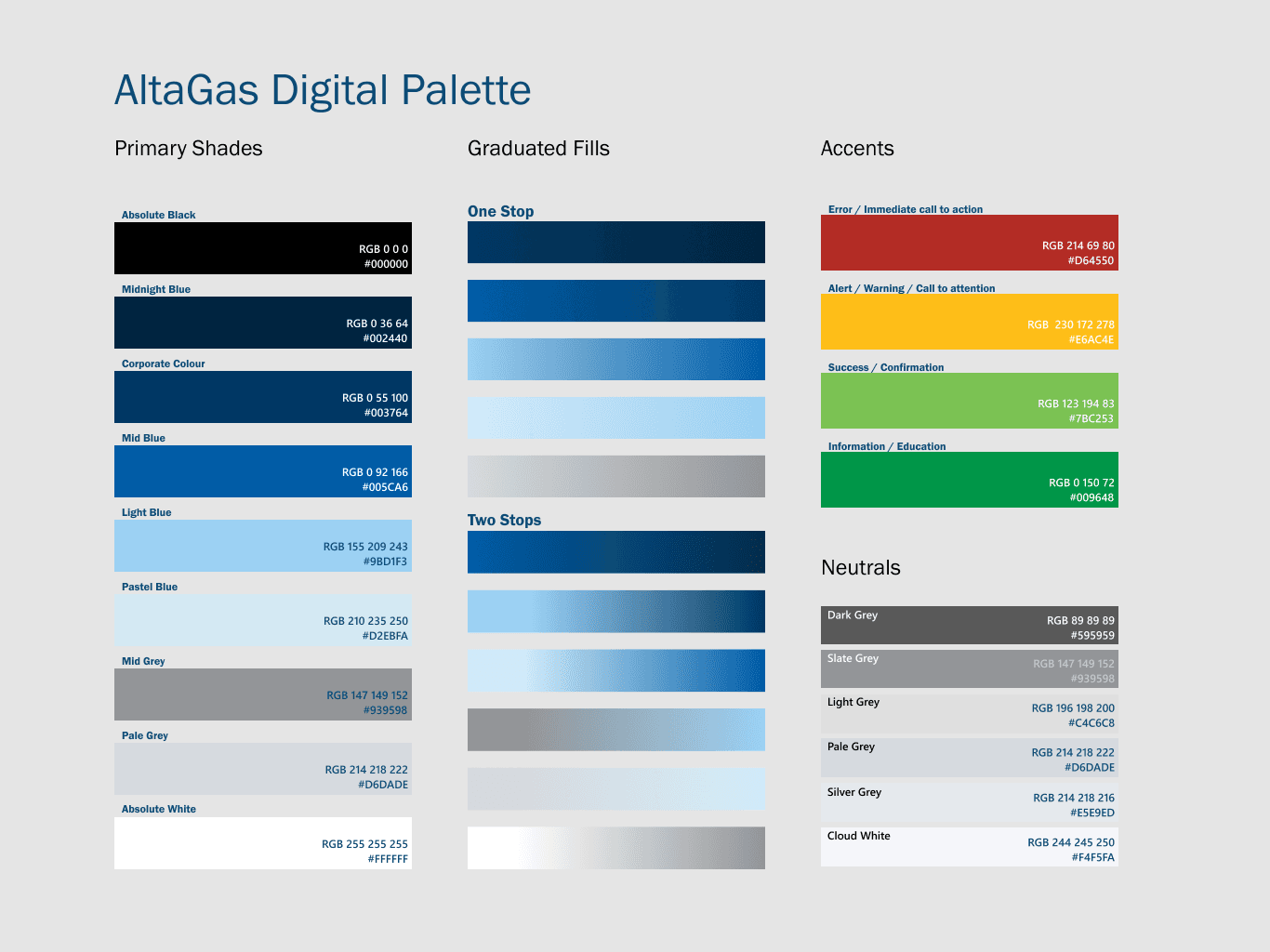
Brand Influence
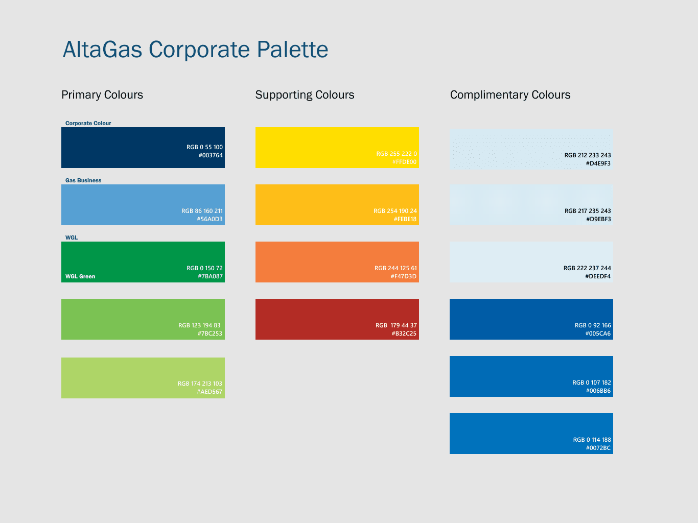
Working with the corporate communications group, we refined the corporate brand colours to work well with all business units and media types.
I selected styles and colour combinations from the pallette that would work well with our digital assets.
Application Components
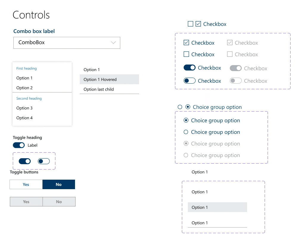
I created common user interface widgets as components in a Figma library, ready to be shared with other designers in the organization.
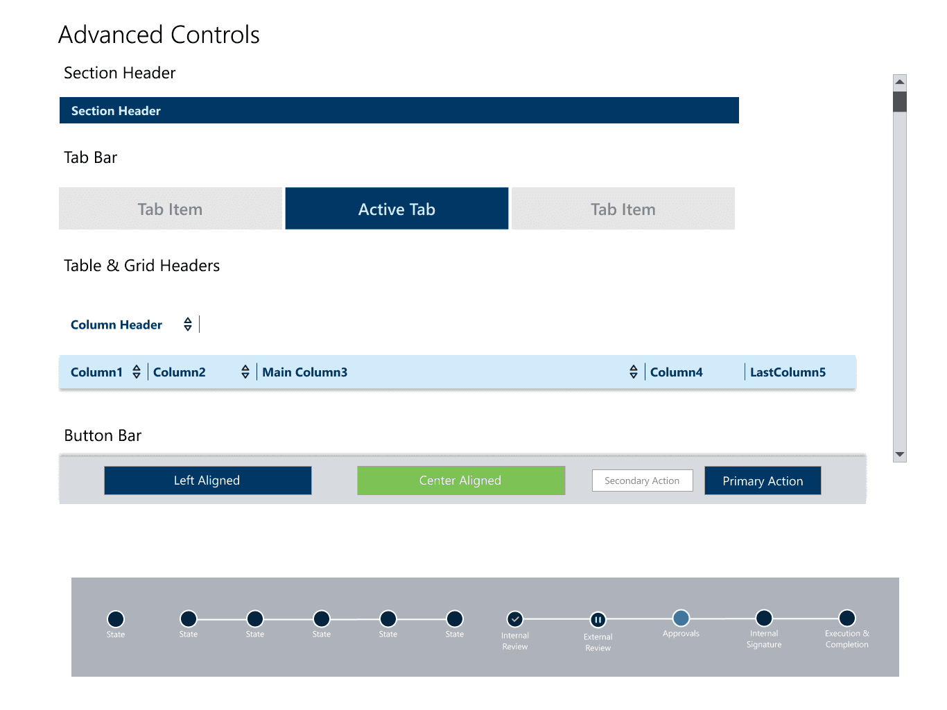
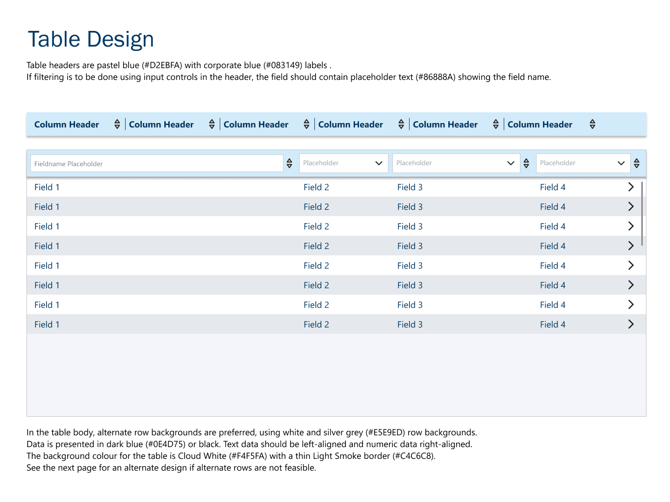
Table Design
Some components were defined common to both application and data presentation, such as tables.
Report Widgets
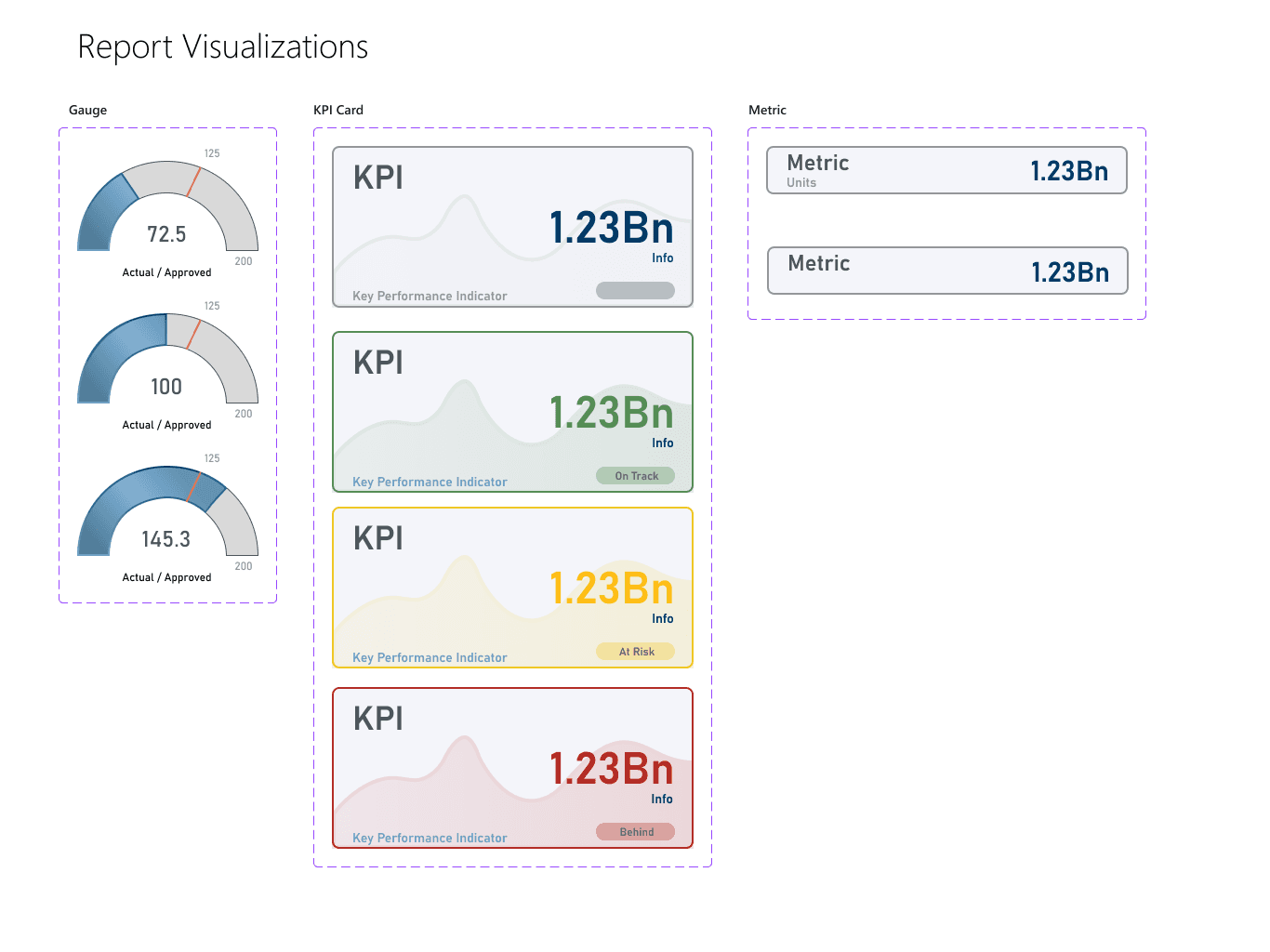
Dashboards and PowerBI reports also needed their own set of widgets for dashboards and analytical data visualization.
KPI cards were of special importance to the business and a lot of effort went into refining their design.