A case study in the development of a new Prime Video feature which could add additional revenue without frustrating users!
A case study in the development of a new Prime Video feature which could add additional revenue without frustrating users!
A case study in the development of a new Prime Video feature which could add additional revenue without frustrating users!
My Role: UX Research & Design, Brand Design, Prototype
Project: UX Team Design Challenge
Duration: 6 weeks, Mar - Apr 2024
Tools used: Figma, ChatGPT, Google Forms & Meet, Zoom
The Problem
Amazon Prime subscribers need a way to seamlessly purchase items related to their favorite shows so they can enjoy shopping without interrupting their viewing experience.
Amazon Prime subscribers need a way to seamlessly purchase items related to their favorite shows so they can enjoy shopping without interrupting their viewing experience.
Amazon Prime subscribers need a way to seamlessly purchase items related to their favorite shows so they can enjoy shopping without interrupting their viewing experience.
The Context
A Quote from Business Insider
The golden age of streaming TV is over.
Netflix revolutionized the way we watch television and movies. But the utopia of choice — watching what we want, whenever we want — could be waning. Ads are creeping in.
The golden age of streaming TV is over.
Netflix revolutionized the way we watch television and movies. But the utopia of choice — watching what we want, whenever we want — could be waning. Ads are creeping in.
The golden age of streaming TV is over.
Netflix revolutionized the way we watch television and movies. But the utopia of choice — watching what we want, whenever we want — could be waning. Ads are creeping in.
https://www.businessinsider.com/the-golden-era-of-streaming-is-over-heres-why-2022-12
Why Amazon Prime Video?
Assumptions:
Every subscriber is a shopper and a viewer
Recent introduction of ads is unpopular with subscribers
Amazon Video is looking for additional revenue generating opportunities and would be open to an alternative to introducing annoying ads.
Why Amazon Prime Video?
Assumptions:
Every subscriber is a shopper and a viewer
Recent introduction of ads is unpopular with subscribers
Amazon Video is looking for additional revenue generating opportunities and would be open to an alternative to introducing annoying ads.
Why Amazon Prime Video?
Assumptions:
Every subscriber is a shopper and a viewer
Recent introduction of ads is unpopular with subscribers
Amazon Video is looking for additional revenue generating opportunities and would be open to an alternative to introducing annoying ads.
The Process
The five stages of Design Thinking:
The Goal
Apply Design Thinking to test our assumptions and come up with some original ideas!
Apply Design Thinking to test our assumptions and come up with some original ideas!
And don’t forget to use the magic ingredient:
And don’t forget to use the magic ingredient:
And don’t forget to use the magic ingredient:
High Fidelity Prototype Demo
Before I go into detail on the process, here's the final result.
I took a novel approach to show the interaction between the mobile app and the TV screen, simulating a user watching a show with phone in hand:
Like what you see?
Let's dive in to the process:
About Amazon Prime video
Video streaming service, for subscribers of Amazon Prime
Users can watch videos and TV shows on demand
Revenue sources
Subscriptions
Advertisements
Digital purchases and rentals
Merchandising
New Advertising model
Introduced Ad-supported video-on-demand (AVOD) model in 2024
Users can pay extra for no ads.
220m
Subscribers worldwide (est.)
$1,400
Average Prime member spends annually on Amazon
80%
Prime members who watch Prime Video
87%
TV viewers who watch with a second screen in hand
220m
Subscribers worldwide (est.)
$1,400
Average Prime member spends annually on Amazon
80%
Prime members who watch Prime Video
87%
TV viewers who watch with a second screen in hand
220m
Subscribers worldwide (est.)
$1,400
Average Prime member spends annually on Amazon
80%
Prime members who watch Prime Video
87%
TV viewers who watch with a second screen in hand
Service Findings
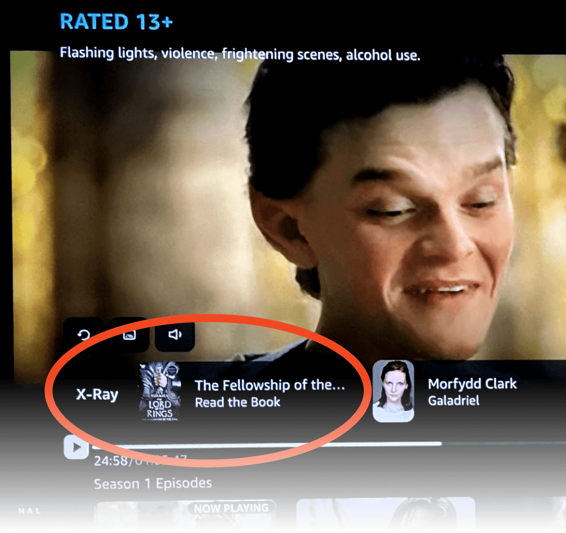
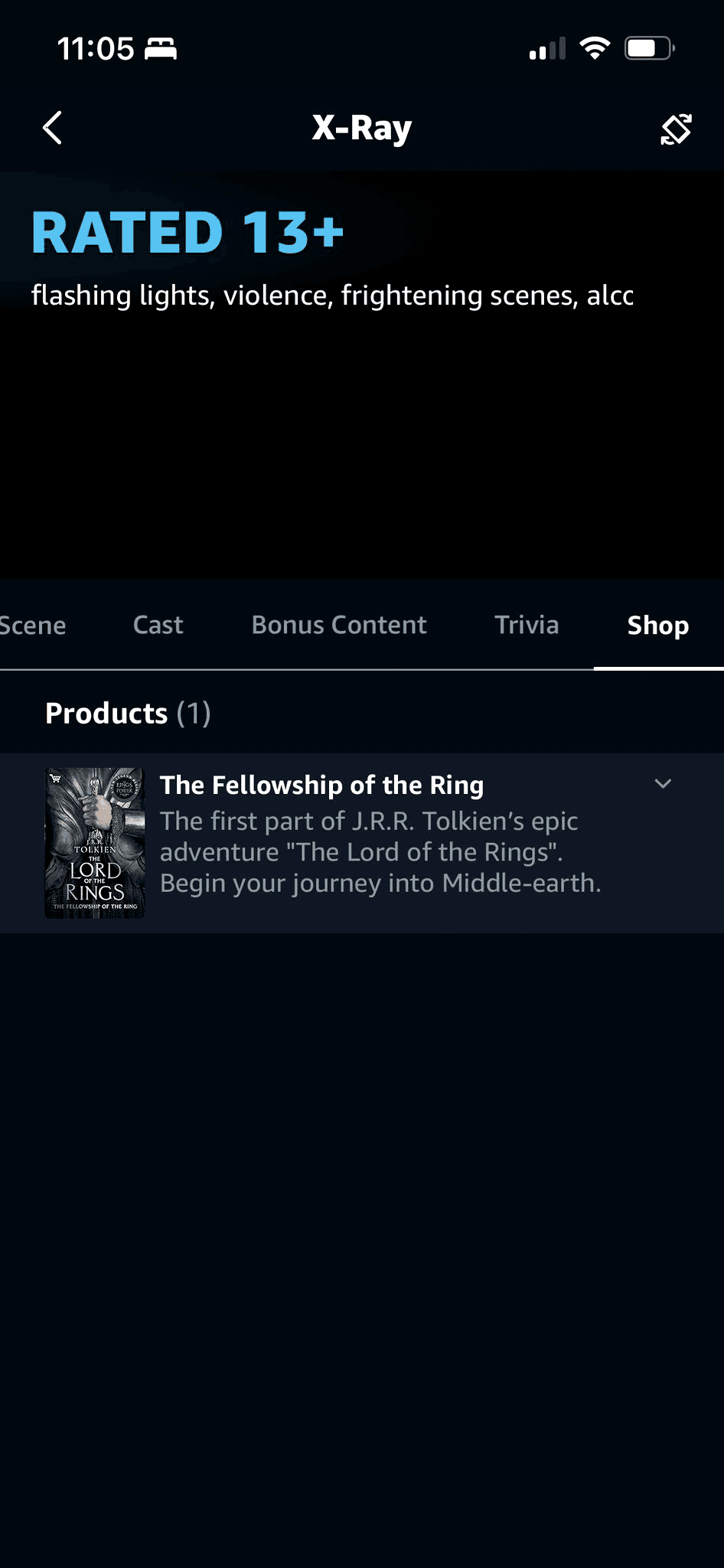
Amazon's Ineffective, Confusing X-Ray Feature
X-Ray is being used to promote products on the TV (left) and the phone (below).
X-Ray integrates show facts from the Internet Movie Database (IMDB).
Through interviews and research, we discovered:
X-Ray confuses many users and so they mostly ignore it
X-Ray has been enhanced to offer product suggestions while you watch
Few shows include product information
The buying process is convoluted
Questions raised:
Is this feature used?
Do users know it exists?
Do users find it intuitive?
Can it be improved upon?
Assumption Confirmed:
Amazon is using other methods of revenue generation to promote sales from its video streaming platform.
Observations:
The feature is not easily discovered by the user
It is not consistently available for all shows
Purchasing requires the user to follow a QR code on the TV or have the app installed.
It's confusing!
Example: Buy Lord of the Rings books from The Rings of Power.
How might we improve X-Ray features to provide eCommerce features that naturally attract the attention of users?
How might we improve X-Ray features to provide eCommerce features that naturally attract the attention of users?
How might we improve X-Ray features to provide eCommerce features that naturally attract the attention of users?
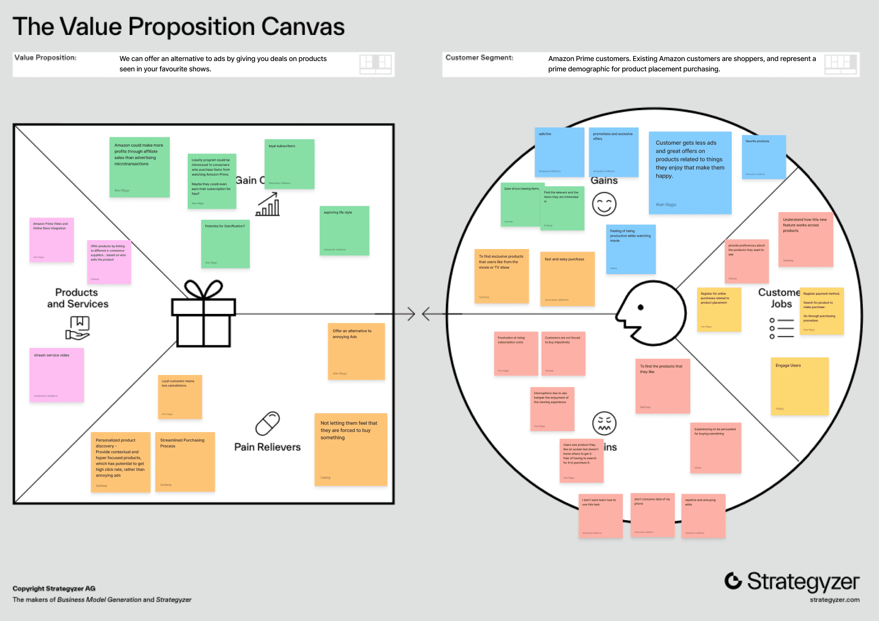
Value Proposition
Value to Amazon
Intuitive interface for buying
Increased revenue
Enhance the X-Ray feature to make it valuable
Innovative and inventive
Customer loyalty - human connection
Value to Prime User
New experience to discover products
Non-intrusive
Seamless shopping experience
Exclusive offers in TV shows
Cool merchandise related to shows they love
User Survey
Why a survey?
Knowing that we had a large target audience, we determined that we needed as wide a sample as possible. Surveying gives us an indication of which demographic groups within the vast Amazon Prime membership pool were best to design for.
We would be able to:
collect qualitative and quantitative data
validate our assumptions
discover subscriber pain points
find common issues with Amazon Prime and Prime Video services.
Participants
26 participants, 10 broad questions, prime members and non-prime members.
Responses
We asked Co-pilot to summarize the results:
AI Response
“Based on the data you provided, the most frustrating causes of user interruption when viewing shows are:
Ads:
Many users expressed frustration with ads, especially those that can’t be skipped. They felt that these interruptions were wasting their time and were particularly annoyed if the ads were unexpected or poorly timed during the show...”
Qualitative
“Ads that you can't skip, I feel frustrated and like it's just wasting my time”
“Ads that you can't skip, I feel frustrated and like it's just wasting my time”
“Ads that you can't skip, I feel frustrated and like it's just wasting my time”
“this is equivalent of toy commercials during kid’s programming and candy on the checkout aisle at kids' eye level”
“this is equivalent of toy commercials during kid’s programming and candy on the checkout aisle at kids' eye level”
“this is equivalent of toy commercials during kid’s programming and candy on the checkout aisle at kids' eye level”
“shoppable content is inevitable as media and merchandise converge...soon fans will appreciate early access and exclusive deals and immerse themselves in their in the favorite stories and characters”
“shoppable content is inevitable as media and merchandise converge...soon fans will appreciate early access and exclusive deals and immerse themselves in their in the favorite stories and characters”
“shoppable content is inevitable as media and merchandise converge...soon fans will appreciate early access and exclusive deals and immerse themselves in their in the favorite stories and characters”
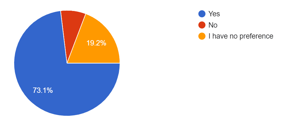
Quantitative
73% prefer Subscription services over cable, satellite and network TV
73% prefer Subscription services over cable, satellite and network TV
73% prefer Subscription services over cable, satellite and network TV
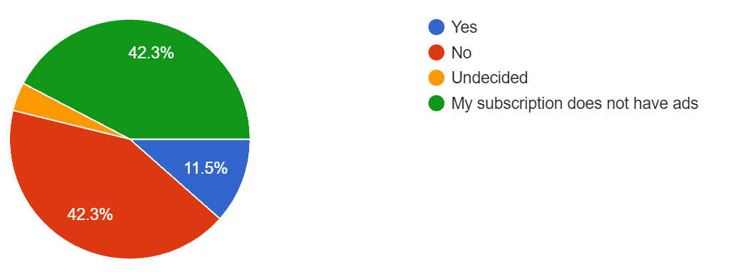
85% of those with Ads would not pay more to remove them
85% of those with Ads would not pay more to remove them
85% of those with Ads would not pay more to remove them
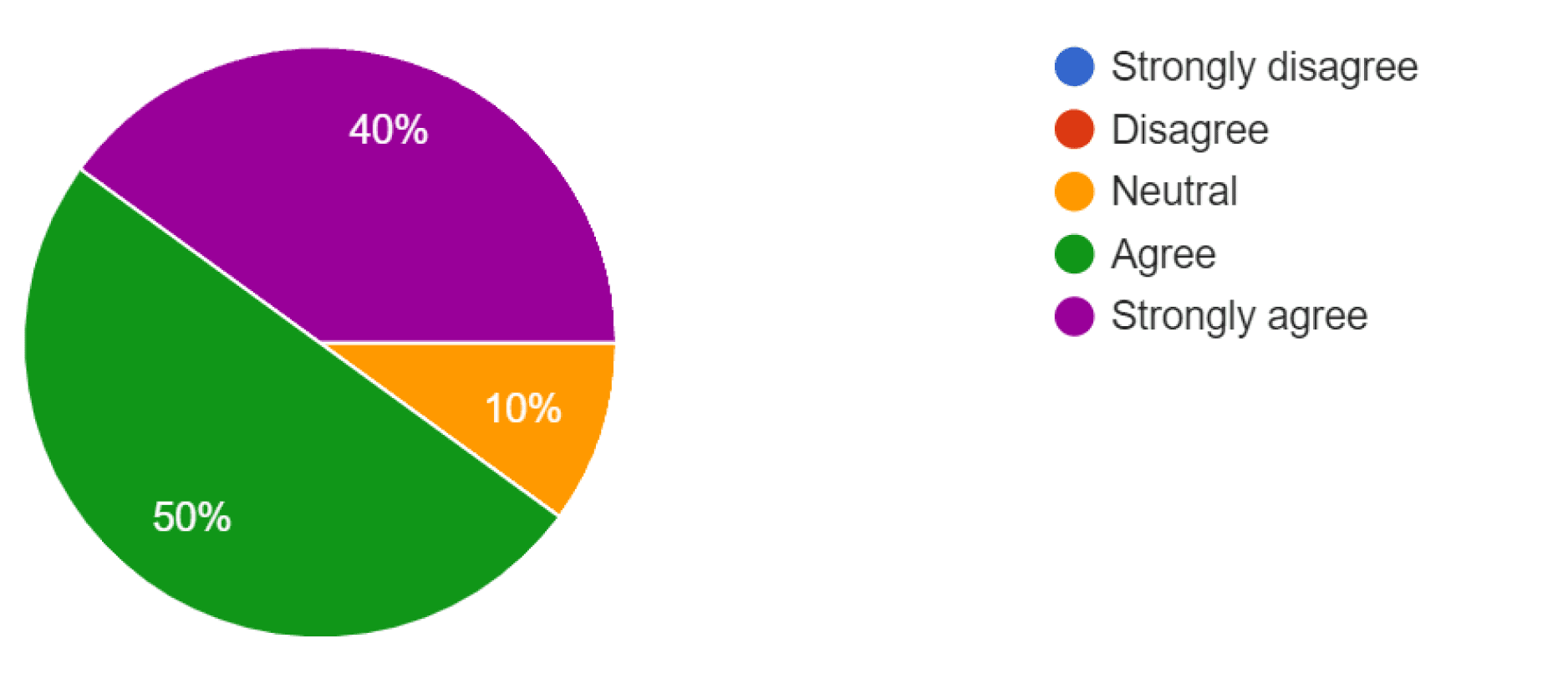
90% of users are less tolerant of ads than they used to be.
90% of users are less tolerant of ads than they used to be
90% of users are less tolerant of ads than they used to be.
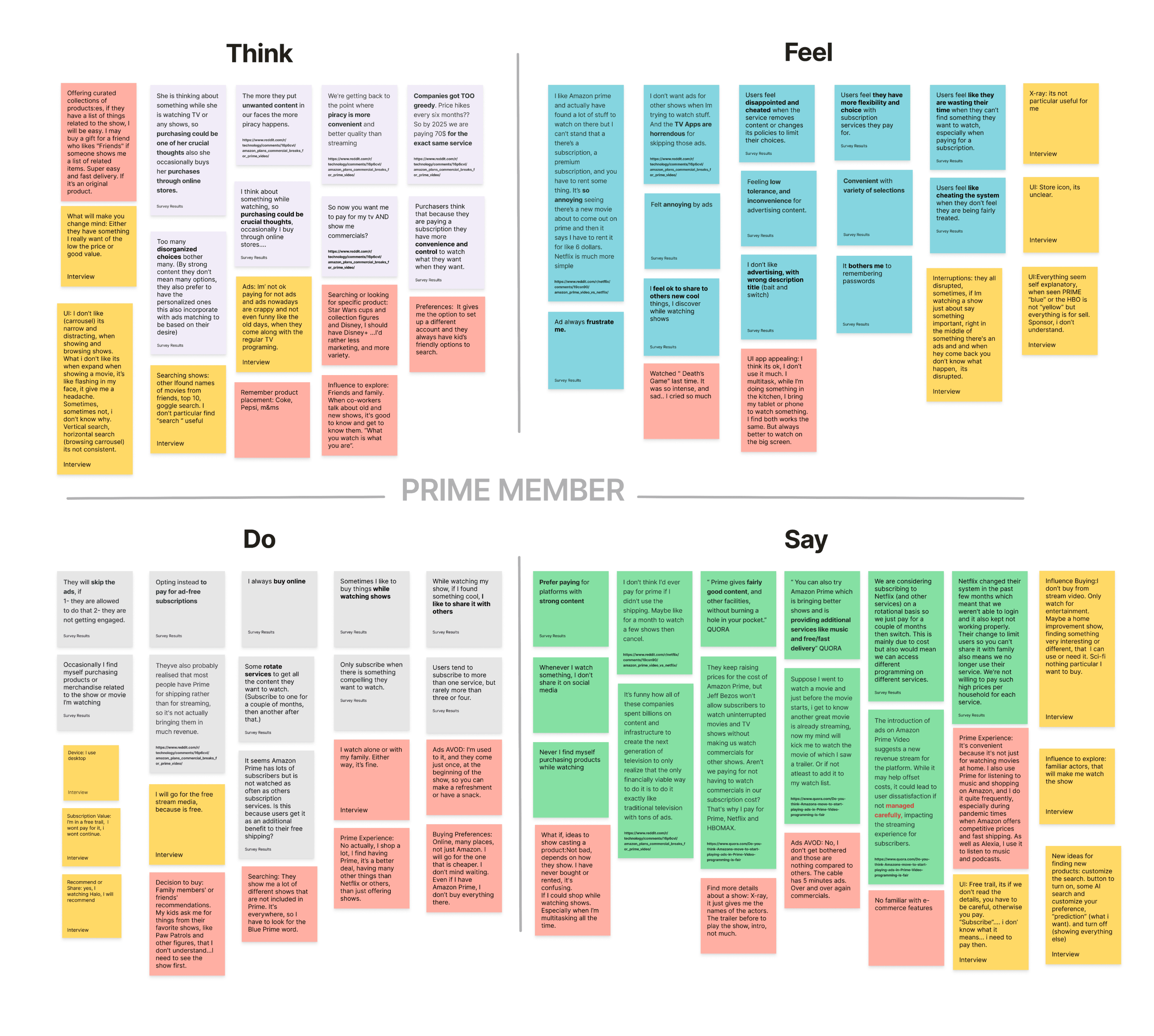
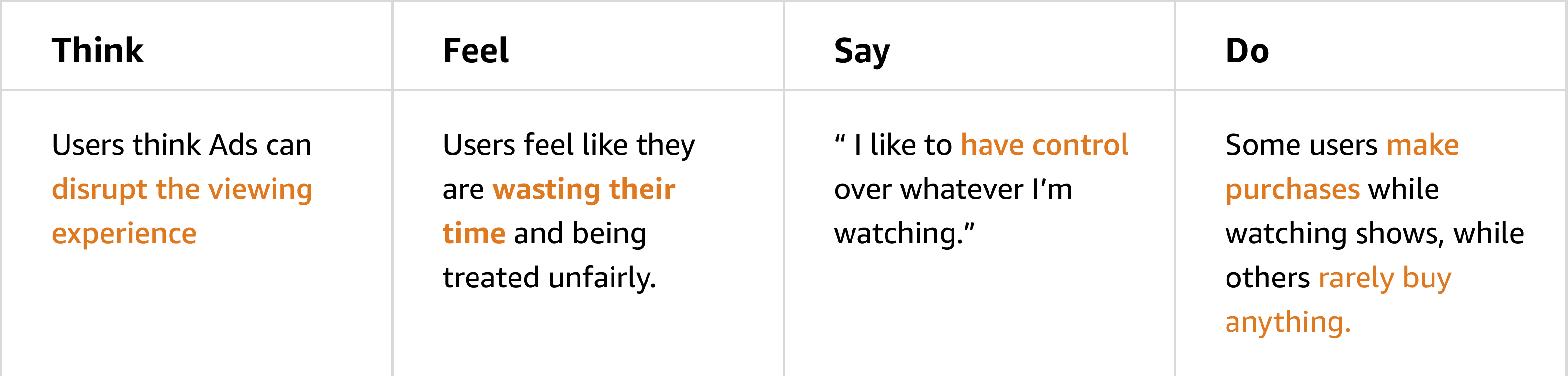
Empathy Map
What do Amazon Prime users Think, Feel, Say and Do?
This process helps us better empathize with users' experiences and preferences, guiding our product development efforts and persona creation.
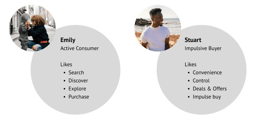
Persona Definition
Designing for a global user base
Designing for an extremely large diverse user base like Amazon Prime is challenging:
The typical user is ‘everyone’
We decided to focus on a subset of the market with a strong desire to purchase, based on our research
a Millennial mother (Emily)
a GenZ male (Stuart)
Our Personas: Emily and Stuart
Key Persona Characteristics
Pain Points
Unwanted interruptions: Full-screen, un-skippable ads are not working for them
Lack of Control: Users pay subscription services for choice and convenience to watch what they want, when they want
Frustration at rising subscription costs without getting any more advantages
Feeling of getting forced to do something which is not their choice
The Problem Statement
Amazon Prime subscribers need a way to seamlessly purchase items related to their favorite shows so they can enjoy shopping without interrupting their viewing experience.
Amazon Prime subscribers need a way to seamlessly purchase items related to their favorite shows so they can enjoy shopping without interrupting their viewing experience.
Amazon Prime subscribers need a way to seamlessly purchase items related to their favorite shows so they can enjoy shopping without interrupting their viewing experience.
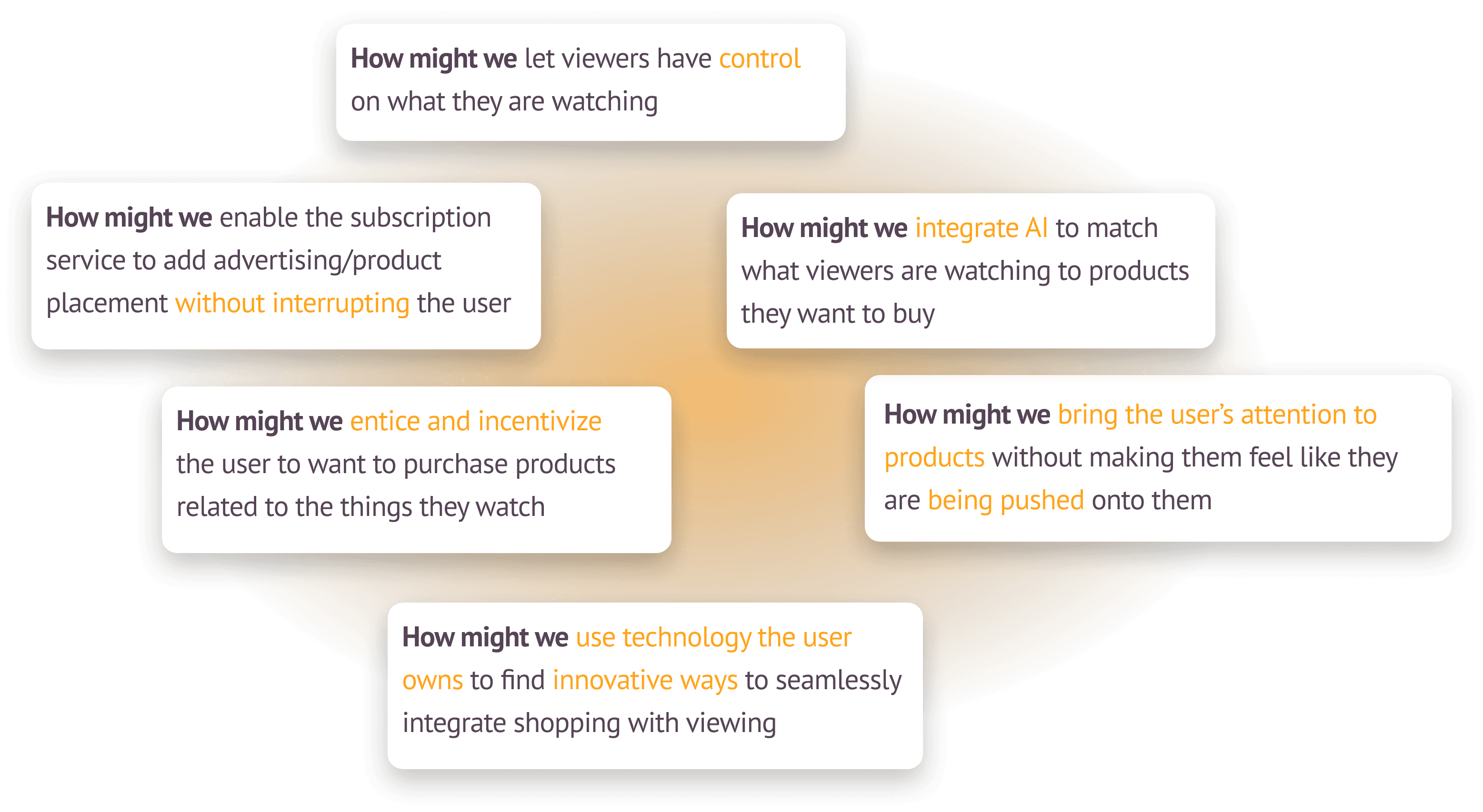
How Might We...
How might we add product discovery and placement without interrupting a subscriber's enjoyment of their viewing experience?
How might we add product discovery and placement without interrupting a subscriber's enjoyment of their viewing experience?
How might we add product discovery and placement without interrupting a subscriber's enjoyment of their viewing experience?
Something I learned
from the Define Phase IterateUX Webinar
For each Problem Statement (the what) come up with several How Might We? statements (the how).
This encourages the team to come up with different approaches to addressing the problem.
Something we learned
from the Define Phase IterateUX Webinar
For each Problem Statement (the what) come up with several How Might We? statements (the how).
This encourages the team to come up with different approaches to addressing the problem.
Something I learned
from the Define Phase IterateUX Webinar
For each Problem Statement (the what) come up with several How Might We? statements (the how).
This encourages the team to come up with different approaches to addressing the problem.
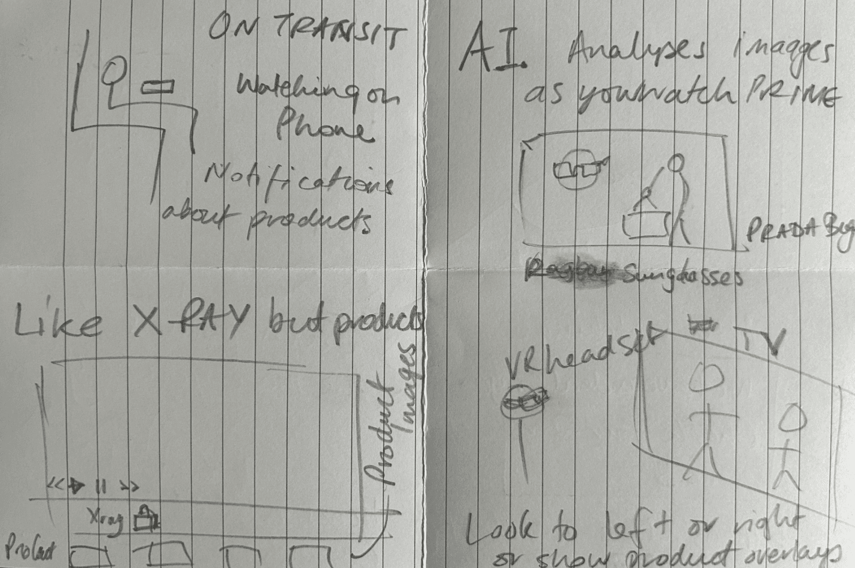
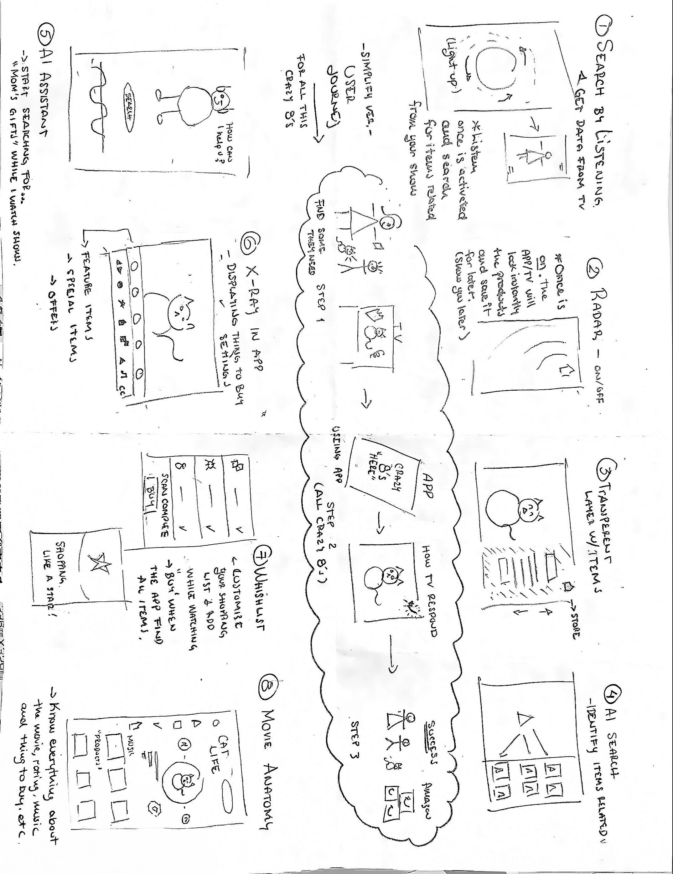
Crazy 8’s
We conducted a Crazy 8’s exercise, identified common themes and listed popular functions, then utilized a voting system to ensure team synergy.
Using mobile phone to control TV
AI search for products on screen
Points for buying merchandise
Push product suggestions & offers to user after watching show
X-Ray like feature focusing on product placement
VR Headset place ads and products beside the screen
Product notification products based on shows
AI Assistant
Search by listening
Radar
Movie Anatomy
Notified later using AI search
Search with remote control device
Search with voice recognition
Movie anatomy
Feature selection
These are the features we chose to expand and explore:
A companion mode to help users seamlessly find products featured onscreen while watching shows
A new feature to help users find & purchase products instead of pushing ads at the user
Integrated AI image search to find items in the Amazon catalog similar to those seen on screen
Seamless vendor push of related product deal suggestions to the user
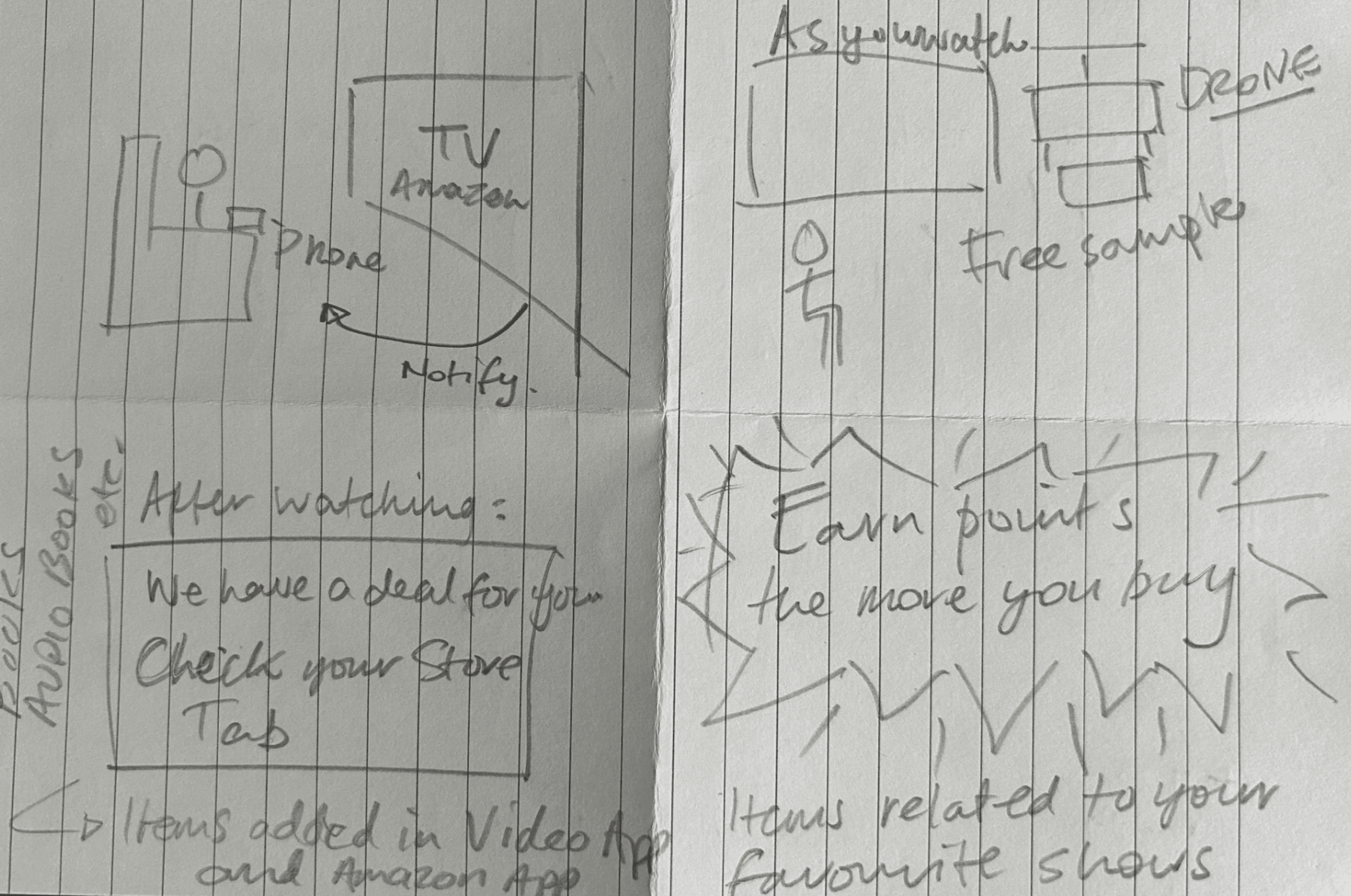
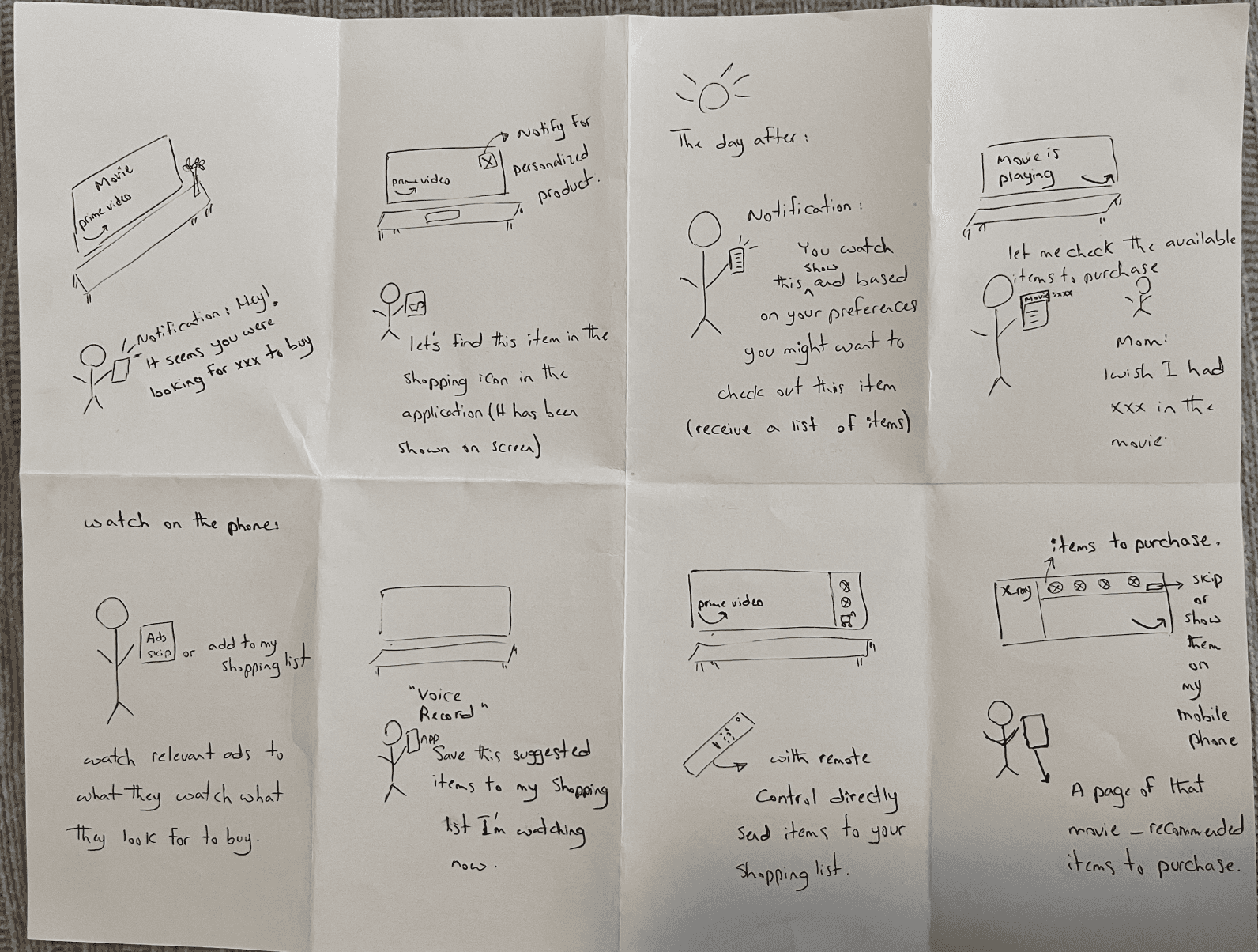
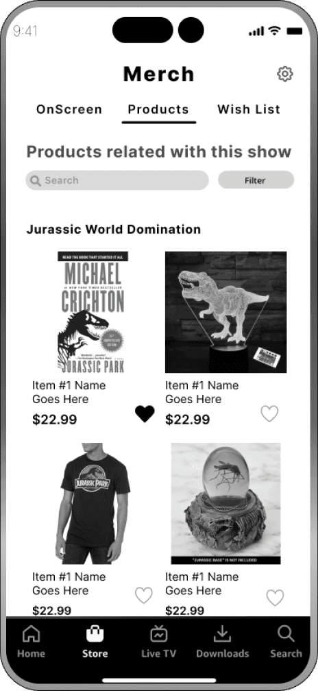
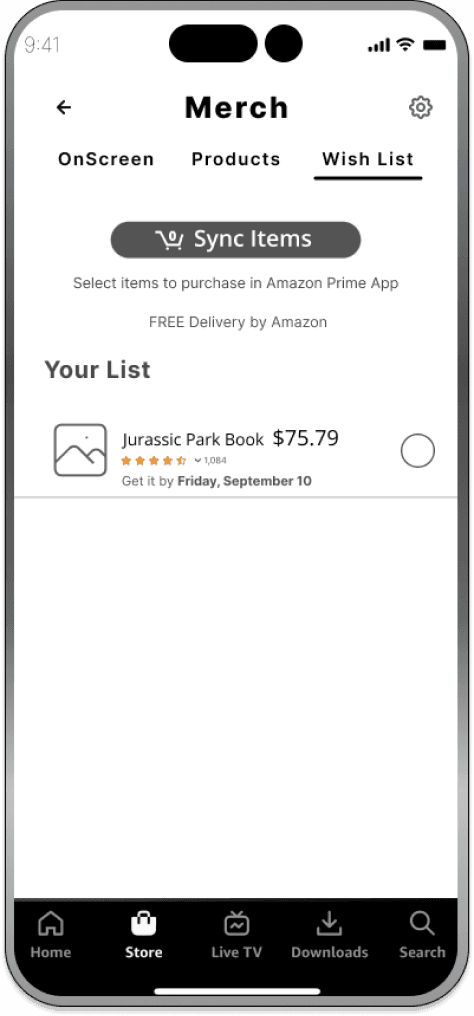
Wireframes
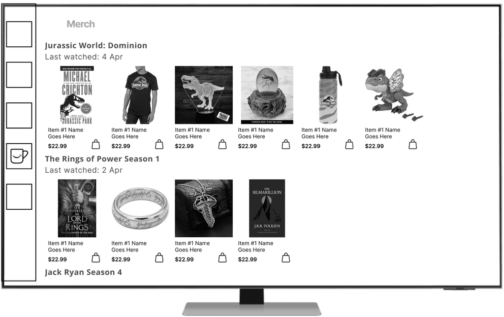
We developed wireframes of the mobile interface and the TV app. This is where the concept of Amazon Merch was born.
Here's a very rough wireframe of the TV interface, showing how merchandise can be associated with the user's viewing history.
Usability Test
Through moderated tests with 8 participants, we analyzed the effectiveness of our two flow prototypes:
Live experience while watching a show
Mobile purchasing experience after watching a show
Goals
The testing is designed to gain insights into user interactions and perceptions, ensuring a seamless and satisfying experience.
Participants
8 Amazon Prime Video members
Task
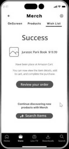
Open the Amazon Prime Video app, and find the new feature called “MERCH” to explore interesting topics and products related to the show.
Explore topics related to the show.
Find a product or item that interests you within the show.
Add the item to your wish list.
Purchase the product
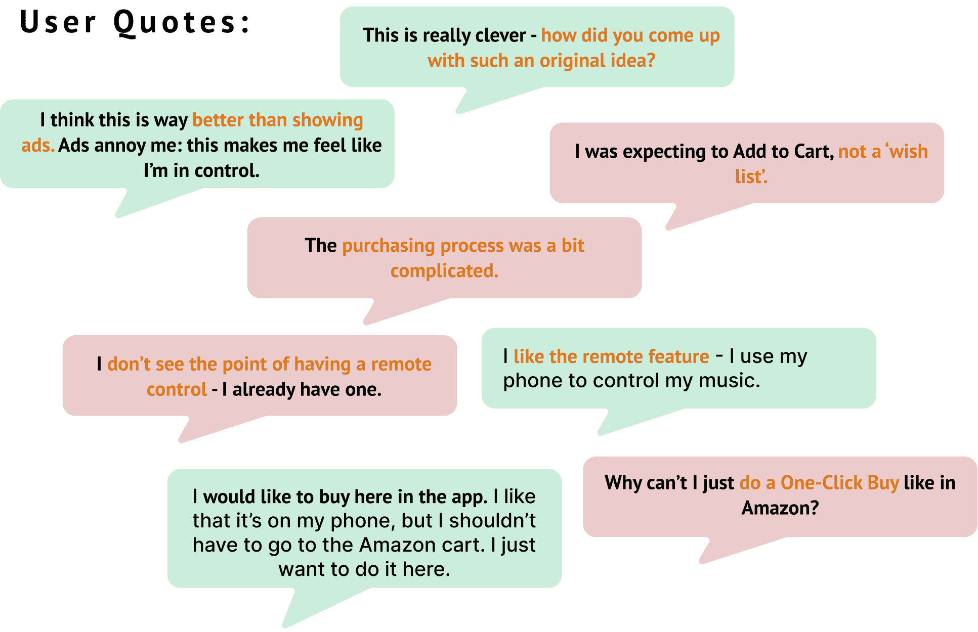
Usability Feedback
What aspects of the prototype do you think work particularly well, and what areas could be improved?
Is there anything specific that would make you more likely to use the product in the future?
Success Metrics
Test Results
Testing identified that the task was not as intuitive as we might have thought. Users found the goal hard to achieve and made assumptions about the interface and the instructions we could not have predicted.
Metrics
Rate of Success:
33%
% of participants who completed the task successfully with no errors
Number of errors:
17
#errors participants made attempting the task
Time on task:
3 min Flow 1 (TV)
4 min Flow 2 (Mobile)
How long does it take to complete the task
Satisfaction rate:
3.4 / 5
How easy or difficult it was to complete the task
Brand Design
I created the Amazon Merch brand design to be immediately identifiable as part of the Amazon brand family. It feels friendly and cozy, like a warm, cheerful mug of hot chocolate!
Icon Evolution
The initial idea for the Merch icon was to create a currency symbol like a dollar sign but using an M. On reflection this started to feel busy and did not scale down well as more elements were included.
We really liked the idea of a mug, as merchandise is stereotypically a branded mug, pen or T-Shirt. The 'a-ha' moment came when adding the Amazon 'swish' arrow to complete the look. It just felt right!
Fun, clean, simple and appealing - and it fit right in with the brand.
Design System
Interface Design Commentary
The design of the app is intended to work to serve two user scenarios:
When browsing their viewing history for suggested products related to the shows they have watched
Simultaneously when watching a show on the Prime TV app
Linking the product deals to the viewing history creates a cognitive association. Users can come here to resume viewing and get distracted into buying on the way!
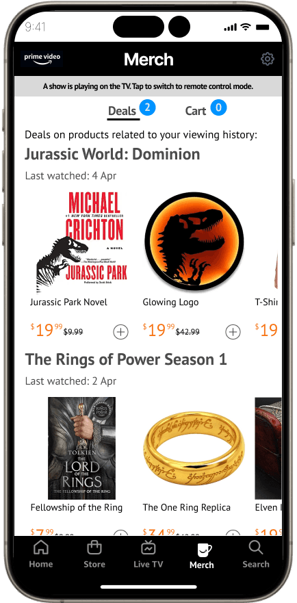
Merch Feature mode
One might expect to find Merch in the store, but the Store is for the purchase of streaming content. Merch is a new feature, so it should be dominant in the interface. It is given it's own place in the toolbar.
Merch shows the user's viewing history and associated merchandise. Product sponsors can push deals to the user, including product placement items.
User Psychology
Discoveries:
users often want to go back to what they were watching
they cognitively remember what they were watching recently.
Empathizing with user thought patterns:
"Remember that show we watched last week - did we watch the last episode?"
"Perhaps I can get gift ideas for my daughter based on that show she was watching?"
"I never did read the book - look it's on sale."
"That collectors item would look really cool on my home theater display shelf."
Merch Feature mode
One might expect to find Merch in the store, but the Store is for the purchase of streaming content. Merch is a new feature, so it should be dominant in the interface. It is given it's own place in the toolbar.
Merch shows the user's viewing history and associated merchandise. Product sponsors can push deals to the user, including product placement items.
User Psychology
We discovered:
users often want to go back to what they were watching
they cognitively remember what they were watching recently.
Putting ourselves into the minds of our users, these are some thought patterns they might have:
"Remember that show we watched last week - did we watch the last episode?"
"Perhaps I can get gift ideas for my daughter based on that show she was watching?"
"I never did read the book - look it's on sale."
"That collectors item would look really cool on my home theater display shelf."
Adding a control feature to Merch gives the users a reason to be here while they watch their favorite shows. It also creates a way to push special deals to the user.
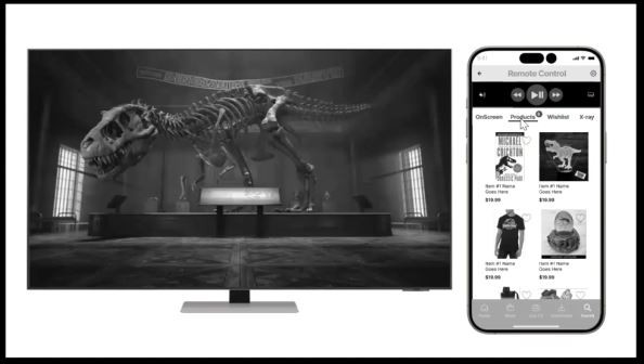
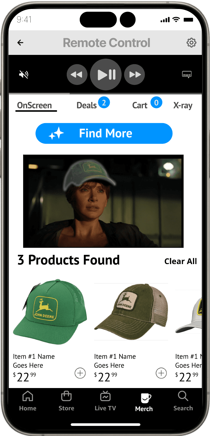
Remote Control mode
The main theme of Merch is to bring attention to related products.
How might we make Merch appeal to the end user?
Reflecting on our findings, we introduced a Remote Control mode within the Merch tab, because:
users, like Stuart, want control
many users have their phone in hand while watching shows
The remote is a convenient feature which can also catch the purchasing attention of a multi-tasking, impulsive user while watching.
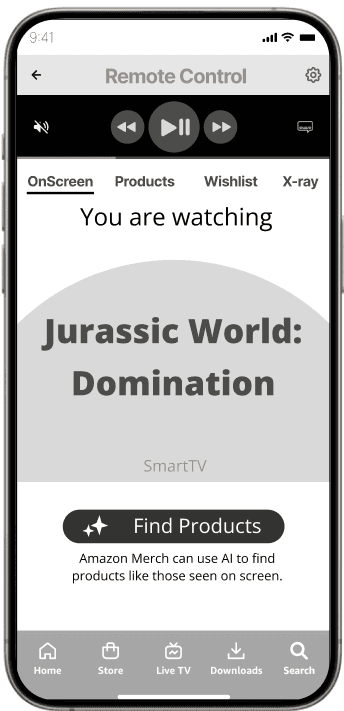
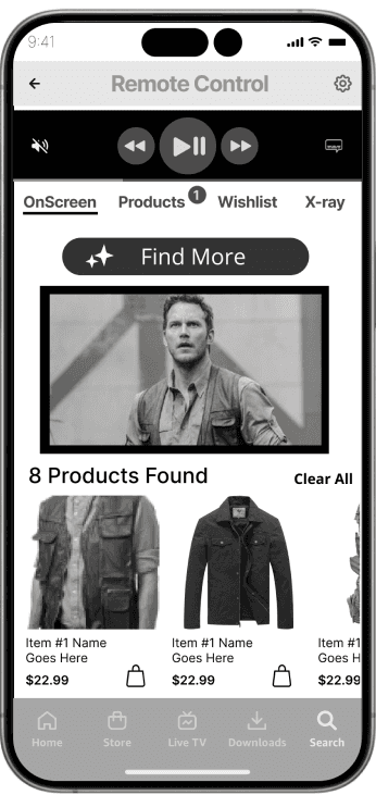
How It Works
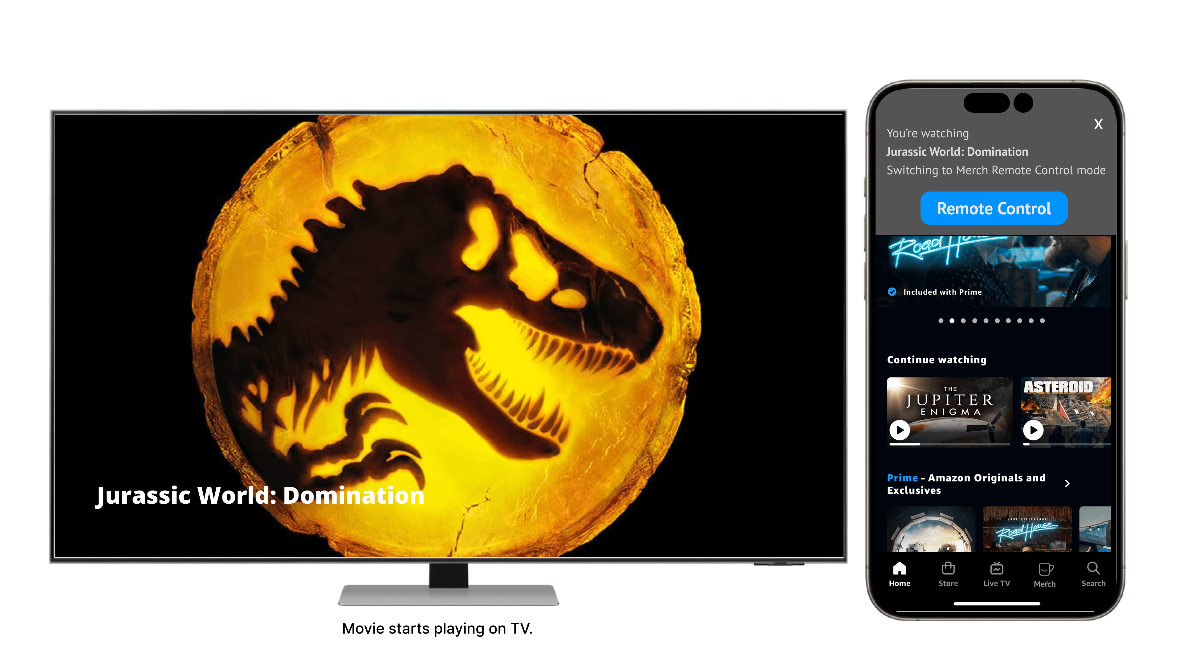
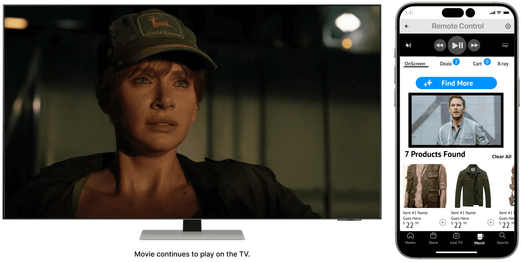
When the user starts watching a show on TV, the app detects this and switches to Remote Control mode.
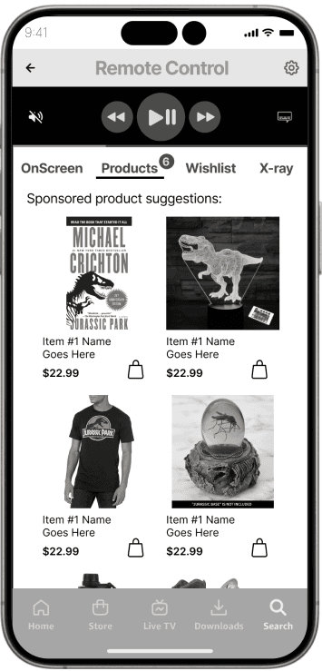
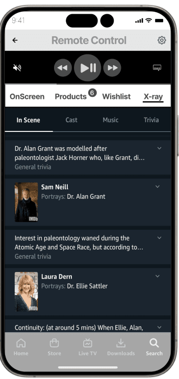
In this mode, two extra tabs appear, OnScreen and X-Ray, plus remote playback controls.
Live X-Ray features here make more sense as part of a remote companion mode on a mobile phone.
The user can use an AI image search to identify products on screen, and find similar products in the Amazon store.
Vendors can push sponsored product deals based on what they are watching.
Ergonomic Control Placement
Traditional wisdom might say the control buttons should be near the bottom within 'thumb reach', but placing them at the top is intentional:
a user with control does not want to accidentally interrupt the movie in a group setting.
the primary intent is for the user to browse and purchase related merchandise during the show. So in this case I want product selection to be within easy reach. Remote control is secondary.
Remote Control mode
The main theme of Merch is to bring attention to related products. How might we make the feature appeal to the end user?
How might we make Merch appeal to the end user?
Reflecting on our findings, we introduced a Remote Control mode within the Merch tab, because:
users, like Stuart, want control
many users have their phone in hand while watching shows
The remote is a convenient feature which can also catch the purchasing attention of a multi-tasking, impulsive user while watching.
How It Works
When a user starts watching a show on TV, the app detects this and offers to switch the user to Remote Control mode. In this mode, two extra tabs appear, OnScreen and X-Ray, plus remote playback controls, with which the user can control the playback, mute sound and turn captions on and off.
Live X-Ray features here make much more sense when part of a remote companion mode on a mobile phone.
The user can use an AI image search to identify products on screen, including any intentional product placements by sponsors. Once objects are identified, similar products are found in the Amazon store catalog.
Ergonomic Control Placement
Traditional wisdom might determine that the control buttons should be placed near the bottom within 'thumb reach', but placing them at the top is intentional:
a user with control does not want to accidentally interrupt the movie in a group setting.
the primary intent is for the user to browse and purchase related merchandise during the show. The main activity of the design is product discovery, not playback control. Having to reach over the playback controls could very well be problematic.
On reflection I realized the great potential for a more human centered product promotion model than traditional advertising.
So many opportunities to discover new things in iterations to come!
Learnings
Different classes of user have different expectations of technology:
Some are completely comfortable with an integrated experience
Some use one device at a time for a specific purpose
Some (typical younger generations) multi-task and have several devices at their fingertips
Users get frustrated if the technology does not allow them to recall past experiences
Next Steps
With so many directions we could go in and features we could explore, we would:
Determine which features are worth pursuing by doing extensive user research to determine what appeals to whom
Refine features and integrate them more smoothly into the prototype
Do extensive user testing and get detailed feedback