Project Overview
This project involved redesigning corporate reports for Executive KPIs and Daily Volumetric Summaries, for the purpose of interactive desktop analysis and onscreen presentation on Digital Signage displays.
In addition a companion app for data entry was to be redesigned.
My Role: UX Designer
Projects: Executive KPI Report. Midstream Operations Daily Summary
Client: AltaGas
Tools used: Figma, Power BI
Business Impact
Well designed, clearly presented reports enable the business to better understand performance at a glance. A lot of work went on behind the scenes to determine what metrics should be tracked and how to aggregate that data into Key Performance Indicators.
With well designed, presentable reports the business was able to include them on digital signage systems across all 12 facilities in the company, improving the proliferation of up to date operational information for over 500 employees each and every day.
Executive KPI Report
The business needed a way to visualize the Key Performance Indicators in a way that was easy to understand and was highly visible.
“How might we display the top key indicators to the business so that the business leaders can more easily know what to focus on?”
Component Design
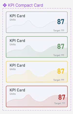
I created a KPI card component in Figma with variants so that I could easily configure the cards in the prototype to show their various states.
Design Prototype
The Figma prototype enabled users to visualize their data and determine how it could be usefully presented on the dashboard, including the unit of measure in which it was presented, as there was no clear standard across the company.
I also introduced the idea that in an interactive context, the cards could be clicked to show a breakout graph in the lower right.
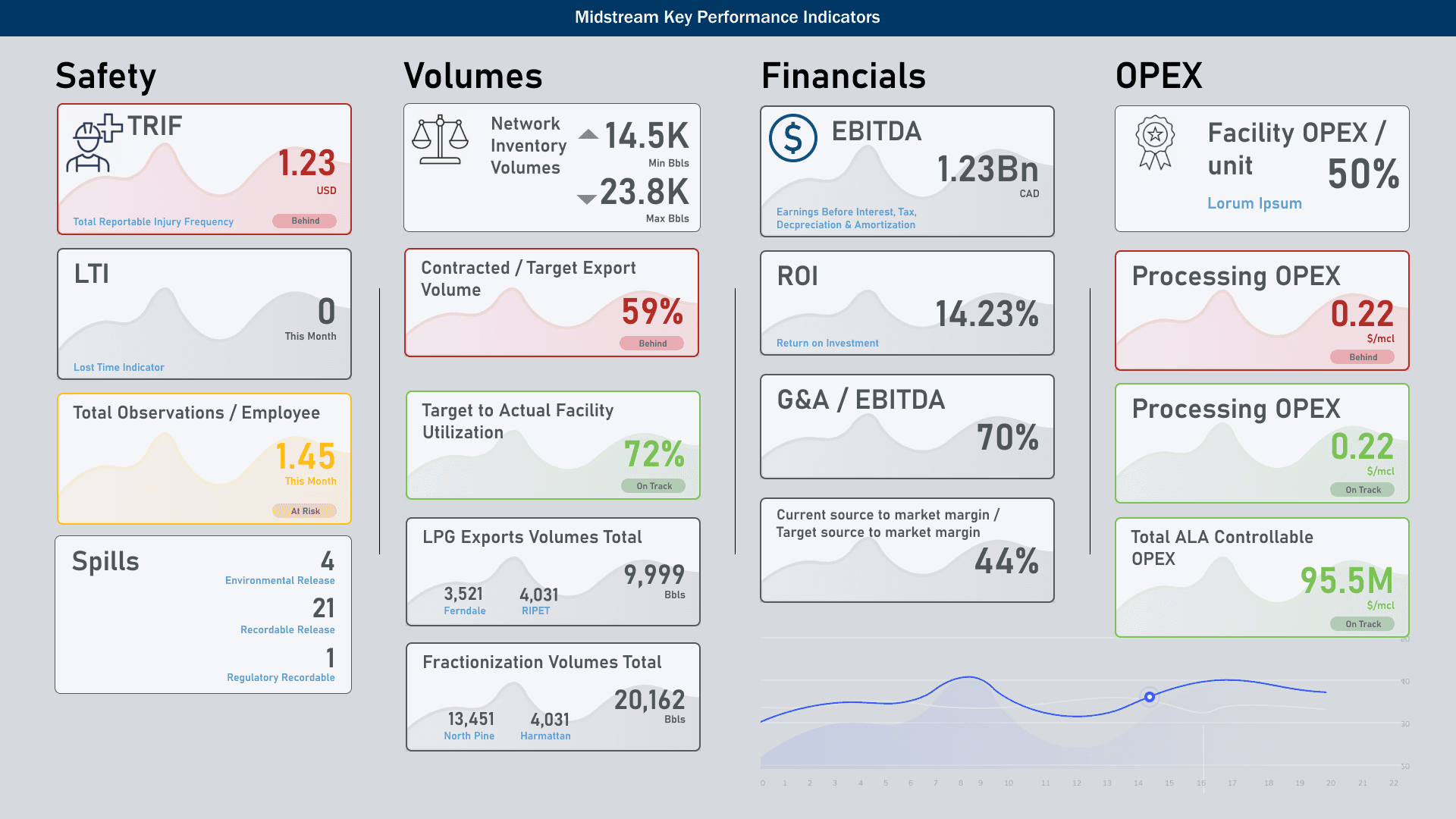
In Production
The report was implemented in Power BI and published on the company’s digital signage system, pictured left in context with other reports.
In a presentation context, the system would rotate through the breakout views.
Daily Summary Report
The Daily Summary started off as a spreadsheet and was implemented as a rudimentary report in Excel and then in PowerBI.
The Initial attempts were informative but confusing and presented information overload.
Before
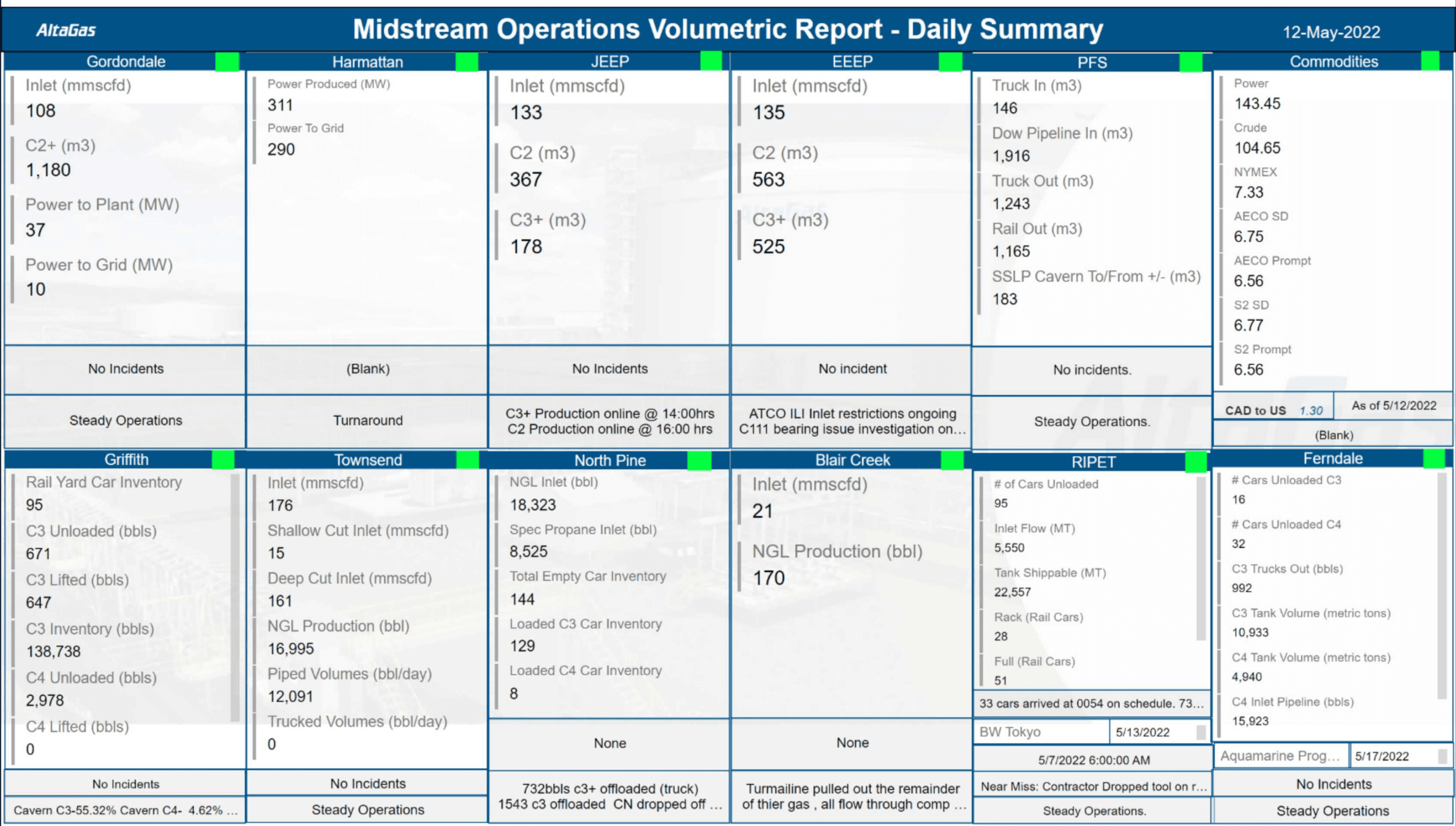
The Daily Summary started off as a spreadsheet and was implemented as a rudimentary report in Excel and then in PowerBI.
The Initial attempts were informative but confusing and presented information overload.
After
After meeting with the business representatives and sketching out some ideas, we decided that an overview dashboard was needed. The business had been desiring this for some time.
This would serve several purposes:
It would schematically show spatial context of the operations and the purpose of each facility.
We wanted to show the flow of the product through the value chain without messy detail. A decision was made to subtly indicate a right to left flow as the product is shipped west to from North America to Asia.
RAG Status.
Red, Amber and Green (RAG) indicators show the state of each facility and the state of the logistics between facilities. These were also implemented as icons to aid those with colour blindness.
Design Iterations
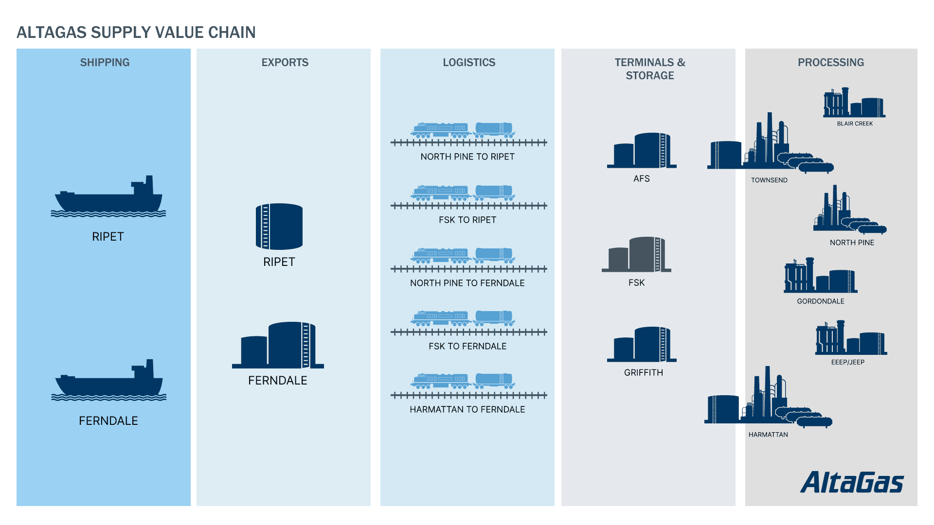
The initial prototype laid out the general entities with orientation from right to left, i.e. East to West. Attempts to draw lines between facilities resulted in a mess, so the Logistics lane was born.
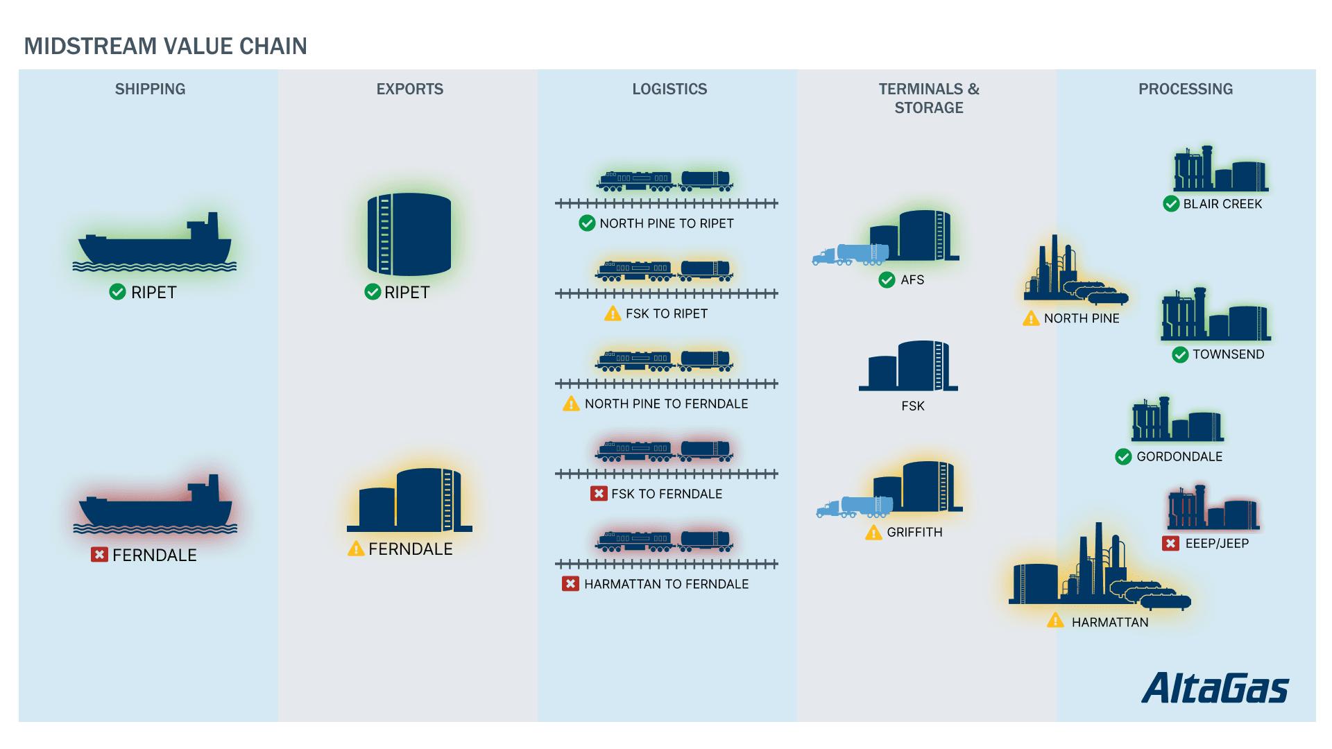
This iteration of the prototype was considered 'too colourful' and the status icons were not clear. Also there was no way to clearly show the status of ground transport vs the state of the facility itself. User feedback informed of the correct graphic representation and logical positioning of each facility.
Final Result
Overview Dashboard
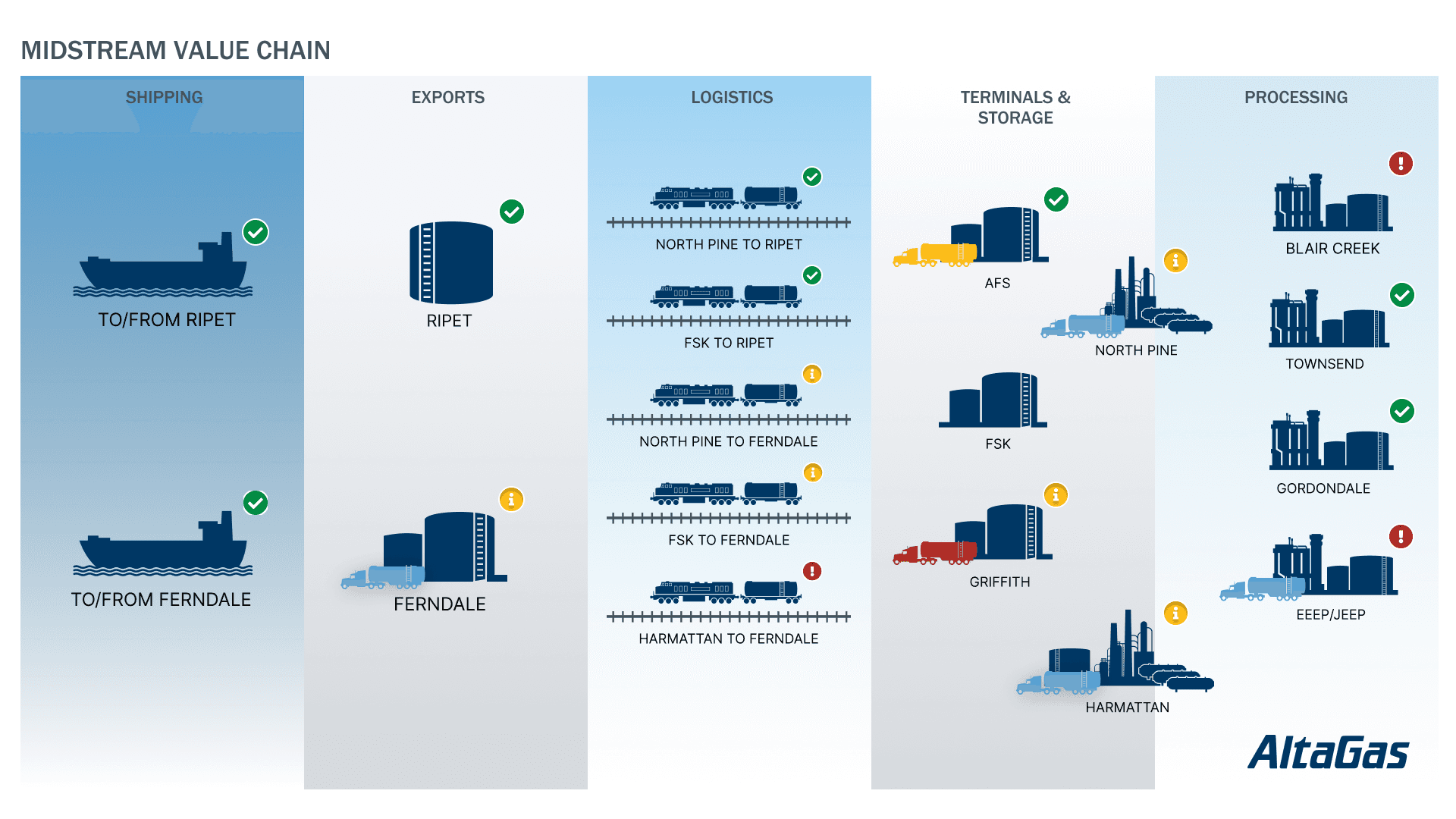
In the final version of the prototype, the status of the ground routes was shown by the colour of the truck icon. (It was not deemed necessary to change the rail icons, as these are abstracted away from the plants for clarity.) The status badge was made more prominent at the top right of each entity.
The dashboard was designed without obvious UI controls, as is was intended for display purposes. However it is also intentionally interactive. Power BI users can load the dashboard and click-through to view more information about each facility.
I felt that only a small amount of direction would be required to inform users of the interactive capability of the prototype, if they did not discover it via intuition.
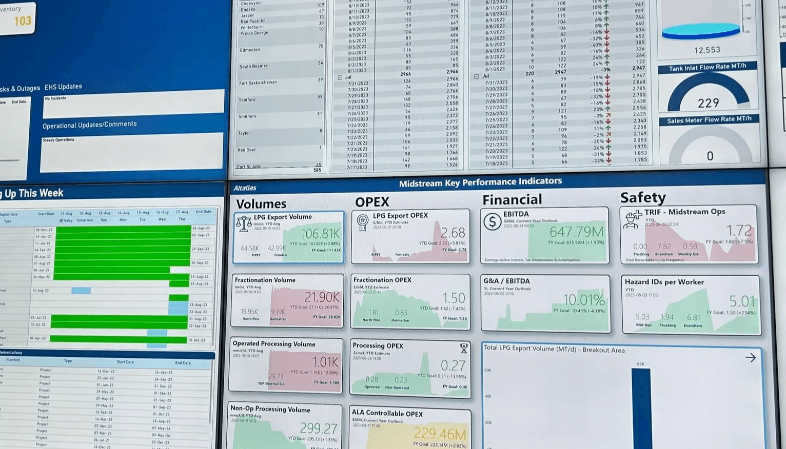
Operations Daily Summary
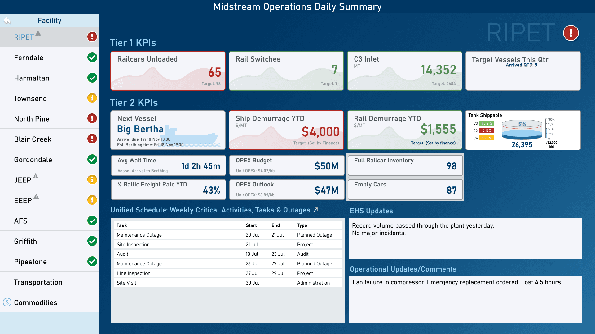
On clicking through the user is presented with a custom, but consistent, view for each facility.
Managers and users at each facility were interviewed to discover the significant information they required to visualize on the summary report.
Cards with RAG status representation are used for each metric, with precedence given to Tier 1 KPIs and significant information such as the Next Vessel expected at port and the quality and volume of shippable inventory in the storage tank.
A lot of thought went into the size, positioning, grouping and data representation of the layout. Secondary information is presented on smaller cards.
Space to show significant upcoming events and daily summary reports were also shown.
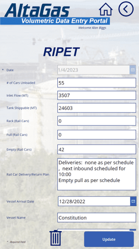
Supporting Data Entry App Design
An application to enter the data manually was also implemented. In the intial phase of the project there was no UX Design involved. And it showed.
Before
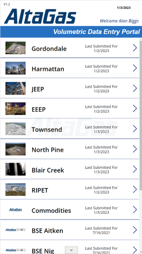
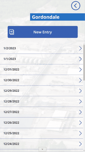
Pre-existing App
The existing app had a lot to be desired. It was visually unappealing and cumbersome to use. Icon placement was almost random and it used a combination of buttons and icons. Use of washed out images in the background just added to the cognitive confusion of the experience.
After
Lo-Fi Prototype
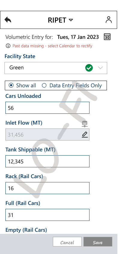
Focus on now - abstract the rest
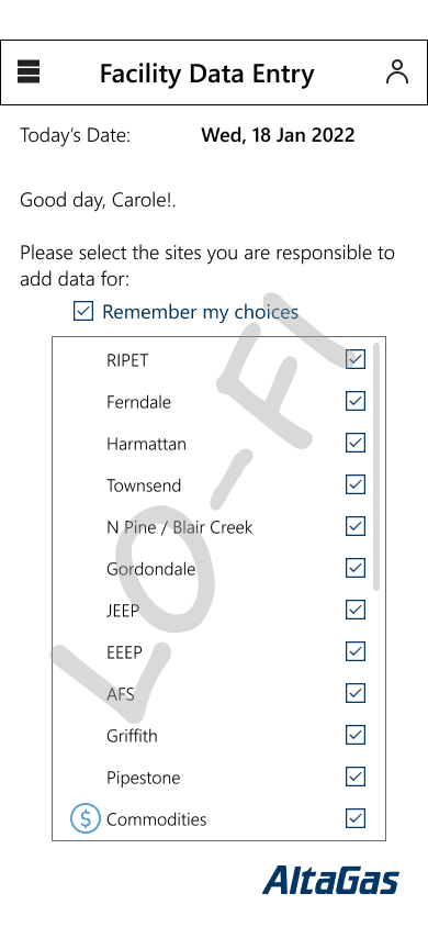
It took just a couple of interviews with users to realize that by adding a way to set the facilities they actually use would immediately help them focus on their daily task of entering data. Adding a calendar control would enable them to look back at a previous entry, which was a rare occurrence. Most of the time, they would enter the data consistently on a daily basis.
Setting Facility Status
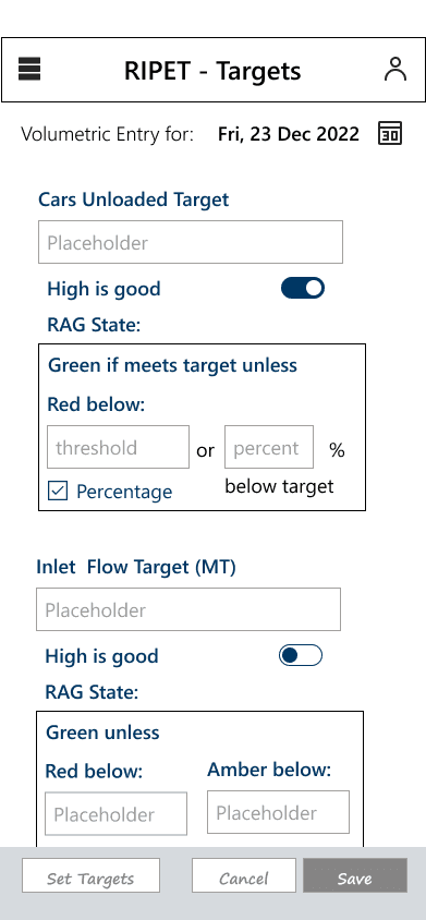
An exercise to present a UI that would allow users to specify rules for setting the status of the facility was attempted. However, this only helped the stakeholders understand that this would be too complex, and decided to allow the status to be set subjectively by the facility owner. They could add their reasoning for going Amber or Red in the notes field.
Hi-Fi Prototype
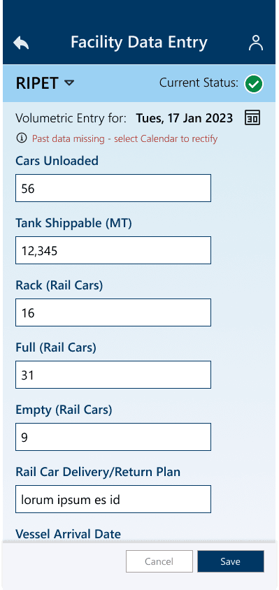
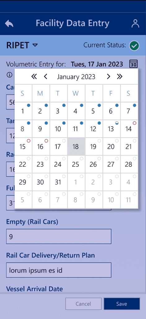
Once the layouts and functionality had been established, I added a splash of colour and added the new manual status mechanism. The calendar widget was customized to show the entry status for each day, so that it was easy for the users to see where data was partially entered or missing.